The psychology of color in interior design: how different colors can affect mood and behavior
Architect Shrawan Azagalle | 20 April 2023

Choosing the right color for your home interior walls can be a daunting task. Not only do you want a color that looks great, but you also want one that creates the right mood and atmosphere for each room. With so many color options available, it can be overwhelming to decide where to start. That's why we've put together this guide to help you choose the best shades of colors for your home interior walls. From calming blues to earthy beiges, we'll discuss the various shades that work well for different rooms and moods. So, whether you're planning a complete home makeover or just looking to refresh your walls, read on to discover the perfect color palette for your home.
Color is a visual sensation that is created by the interaction of light and the human eye. There are three primary colors: red, blue, and yellow, which cannot be created by mixing other colors. By combining these primary colors, we can create secondary colors, which are green, orange, and purple. When we mix these colors further, we can create tertiary colors, which are variations of the primary and secondary colors. Colors can also be described as warm or cool. Warm colors, such as red, orange, and yellow, tend to be associated with energy, excitement, and warmth. Cool colors, such as blue, green, and purple, tend to be associated with calmness, relaxation, and tranquility. In addition to warm and cool colors, colors can also be described as light or dark, bright or muted, and saturated or desaturated. Light colors are those that are closer to white, while dark colors are those that are closer to black. Bright colors are those that are highly saturated and vibrant, while muted colors are those that are less saturated and softer. Saturation refers to the intensity or purity of a color, while desaturation refers to the reduction in intensity or purity. Each color can evoke different emotions and moods, and the way they are used in design can greatly impact the overall feel of a space.
Red
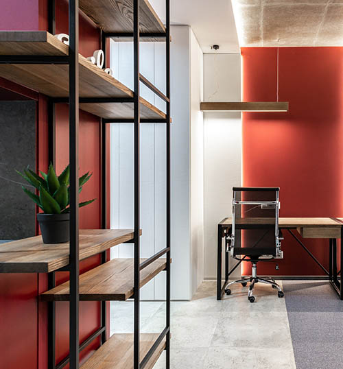
Red is a bold and passionate color that can add a lot of energy to a space. It's a popular color choice for interior walls in areas where people gather, such as living rooms, dining rooms, and kitchens. When used correctly, red can create a cozy and intimate atmosphere or a bold and dramatic feel, depending on the shade.
Darker shades of red, such as burgundy or maroon, are ideal for creating a warm and intimate atmosphere in a room. These shades are perfect for a cozy living room or bedroom and pair well with neutral colors like beige or gray. Burgundy or maroon accent walls can also add depth and richness to a space. Sherwin-Williams' Heartthrob SW 6866 and Benjamin Moore's Caliente AF-290 are popular shades of dark red that work well on interior walls. The hex color codes for these shades are #b53f41 and #d32f2f, respectively.
Brighter shades of red, such as crimson or scarlet, are ideal for creating a bold and dramatic feel in a space. These shades work well in large, open areas like living rooms and dining rooms, where they can be used to make a statement. These shades also pair well with neutral colors like white or gray. Farrow & Ball's Incarnadine No. 248 is a popular shade of bright red that works well on interior walls. Its hex color code is #b22d30.
Lighter shades of red, such as pink or blush, are perfect for creating a more playful and feminine vibe in a space. These shades work well in bedrooms, bathrooms, or other areas where a soft and relaxing atmosphere is desired. These shades also pair well with neutral colors like white or gray. Benjamin Moore's First Light 2102-70 and Sherwin-Williams' Intimate White SW 6322 are popular shades of light red that work well on interior walls. Their hex color codes are #f5f3e9 and #f3e3e3, respectively.
When using red on your walls, it's important to balance it with neutral or complementary colors to avoid overwhelming the space. Neutral colors like beige, gray, or white can help tone down the boldness of red, while complementary colors like green or blue can add depth and contrast.
Yellow
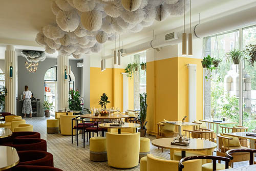
Yellow is a bright and cheerful color that can bring a sunny and optimistic vibe to any space. However, the shade of yellow you choose can greatly impact the mood and atmosphere of a room. In this article, we'll explore the different shades of yellow and their effects on mood and behavior, as well as provide hex color codes for each shade.
Light yellow, sometimes called lemon or pale yellow, is a soft and delicate shade that can create a cozy and inviting atmosphere. This shade of yellow is perfect for bedrooms or living rooms, where you want to create a relaxing and comfortable space. Light yellow can also be a great choice for kitchens and dining rooms, where it can create a warm and welcoming environment. The hex color code for light yellow is #FFFFE0.
Bright yellow, sometimes called sunflower or golden yellow, is a bold and energetic shade that can add a pop of color to any space. This shade of yellow is perfect for home offices or workout rooms, where you want to create a high-energy environment. Bright yellow can also be a great choice for bathrooms or laundry rooms, where it can add a cheerful and lively feel. The hex color code for bright yellow is #FFD700.
Mustard yellow is a warm and earthy shade that can add a cozy and rustic feel to any space. This shade of yellow is perfect for bedrooms or living rooms with a bohemian or vintage aesthetic. Mustard yellow can also be a great choice for entryways or hallways, where it can create a welcoming and inviting atmosphere. The hex color code for mustard yellow is #FFDB58.
Pastel yellow is a soft and muted shade that can create a calming and serene atmosphere. This shade of yellow is perfect for bathrooms or bedrooms, where you want to create a peaceful and relaxing space. Pastel yellow can also be a great choice for nurseries or children's rooms, where it can create a playful and whimsical feel. The hex color code for pastel yellow is #FDFD96.
Blue
Blue is a calming and soothing color that can create a serene atmosphere in any room. When it comes to choosing the right shade of blue for your interior walls, it's important to consider the mood and atmosphere you want to create.
Powder Blue (#B0E0E6) is a light, cool blue that's perfect for creating a soft and calming ambiance. It works well in bedrooms, bathrooms, and other spaces where relaxation is key.
Sky Blue (#87CEEB) is a cheerful and refreshing shade of blue that can bring a sense of lightness and openness to a room. It's perfect for use in living rooms, kitchens, and other common areas where you want to create a lively and inviting atmosphere.
Pale Blue (#ADD8E6) is a subtle and sophisticated shade of blue that can add a touch of elegance to any space. It works well in formal dining rooms, home offices, and other areas where a refined and polished look is desired.
Navy Blue (#000080) is a deep, rich blue that's perfect for creating a cozy and intimate atmosphere. It works well in bedrooms, home theaters, and other spaces where you want to create a sense of warmth and comfort.
Royal Blue (#4169E1) is a bold and vibrant shade of blue that can add a touch of drama and excitement to any room. It works well as an accent wall in living rooms, dining rooms, and other areas where you want to create a focal point.
Green
Green is a refreshing and calming color that can bring a sense of nature and balance to any room. When it comes to choosing the right shade of green for your interior walls, it's important to consider the mood and atmosphere you want to create.
Sage Green (#C1D8C5) is a muted green that can create a calming and relaxing atmosphere. It's perfect for use in bedrooms, bathrooms, and other spaces where you want to create a peaceful and serene ambiance.
Olive Green (#556B2F) is a warm and earthy shade of green that can create a cozy and inviting atmosphere. It works well in living rooms, kitchens, and other common areas where you want to create a comfortable and welcoming space.
Mint Green (#98FB98) is a fresh and vibrant shade of green that can bring a sense of energy and vitality to a room. It's perfect for use in home offices, playrooms, and other areas where you want to create a lively and invigorating atmosphere.
Forest Green (#228B22) is a rich and luxurious shade of green that can add a touch of drama and sophistication to any space. It works well in formal dining rooms, home theaters, and other areas where you want to create a sense of elegance and refinement.
Hunter Green (#355E3B) is a deep, dark shade of green that can create a sense of warmth and intimacy in a room. It works well in bedrooms, libraries, and other spaces where you want to create a cozy and intimate atmosphere.
Gray
Gray is a versatile and sophisticated color that can create a range of moods and atmospheres depending on the shade you choose. When it comes to choosing the right shade of gray for your interior walls, it's important to consider the mood and atmosphere you want to create
Light Gray (#D3D3D3) is a soft and subtle shade of gray that can create a calming and relaxing atmosphere. It's perfect for use in bedrooms, bathrooms, and other spaces where you want to create a serene and peaceful ambiance.
Warm Gray (#808080) is a cozy and inviting shade of gray that can create a sense of warmth and comfort in a room. It works well in living rooms, kitchens, and other common areas where you want to create a comfortable and welcoming space.
Charcoal Gray (#36454F) is a deep and dramatic shade of gray that can add a touch of sophistication and elegance to any space. It works well in formal dining rooms, home offices, and other areas where you want to create a sense of refinement and luxury.
Blue-Gray (#6E7B8B) is a cool and soothing shade of gray that can create a relaxing and peaceful atmosphere. It works well in bedrooms, bathrooms, and other spaces where you want to create a tranquil and serene ambiance.
Greige (#BEBEBE) is a warm and neutral shade of gray that can work well in a variety of settings. It can create a calming and relaxing atmosphere in bedrooms and bathrooms, or a cozy and inviting atmosphere in living rooms and other common areas.
Beige
Beige is a warm and versatile color that can create a range of moods and atmospheres depending on the shade you choose. When it comes to choosing the right shade of beige for your interior walls, it's important to consider the mood and atmosphere you want to create
Creamy Beige (#F5F5DC) is a soft and inviting shade of beige that can create a cozy and warm atmosphere in a room. It works well in living rooms, dining rooms, and other areas where you want to create a comfortable and welcoming space
Warm Beige (#D2B48C) is a rich and earthy shade of beige that can create a sense of warmth and comfort in a room. It works well in bedrooms, bathrooms, and other spaces where you want to create a relaxing and serene ambiance.
Taupe (#483C32) is a sophisticated and elegant shade of beige that can add a touch of luxury and refinement to any space. It works well in home offices, libraries, and other areas where you want to create a sense of elegance and sophistication.
Sand (#C2B280) is a natural and calming shade of beige that can create a sense of tranquility and relaxation in a room. It works well in bedrooms, bathrooms, and other spaces where you want to create a peaceful and serene atmosphere.
Greige (#BEBEBE) is a neutral and versatile shade of beige that can work well in a variety of settings. It can create a calming and relaxing atmosphere in bedrooms and bathrooms, or a cozy and inviting atmosphere in living rooms and other common areas
White
White is a classic and timeless color that can create a range of moods and atmospheres depending on the shade you choose. When it comes to choosing the right shade of white for your interior walls, it's important to consider the mood and atmosphere you want to create.
Pure White (#FFFFFF) is a bright and clean shade of white that can create a fresh and modern atmosphere in a room. It works well in kitchens, bathrooms, and other areas where you want to create a bright and airy space.
Off-White (#F5F5F5) is a warm and inviting shade of white that can create a cozy and welcoming atmosphere in a room. It works well in living rooms, dining rooms, and other areas where you want to create a comfortable and inviting space.
Ivory White (#FFFFF0) is a soft and delicate shade of white that can create a romantic and dreamy atmosphere in a room. It works well in bedrooms, bathrooms, and other spaces where you want to create a serene and tranquil ambiance.
Antique White (#FAEBD7) is a muted and rustic shade of white that can create a sense of nostalgia and vintage charm in a room. It works well in home offices, libraries, and other areas where you want to create a cozy and intimate atmosphere.
Bright White (#F8F8FF) is a crisp and cool shade of white that can create a minimalist and modern atmosphere in a room. It works well in contemporary and industrial-style spaces where you want to create a clean and uncluttered look.
"These are just a few examples of the many shades of colors that can work well for interior walls. When choosing a shade of colors, be sure to take into account the amount of natural light in the room, as well as the other colors and elements in the space. This will help ensure that you choose a shade of colors that complements the rest of your decor and creates the mood and atmosphere you desire."
In conclusion, the psychology of color in interior design is a fascinating topic that can help homeowners create the perfect mood and atmosphere in their living spaces. By understanding how different colors can affect our mood and behavior, you can choose the right shade of color for your walls and create a space that is both functional and aesthetically pleasing. When selecting colors for your home interior, be sure to consider the mood and atmosphere you want to create, as well as the other colors and elements in the space. Experimenting with different shades of colors can be a fun and exciting process that can help you find the perfect fit for your home. If you need further assistance with interior design or color selection, don't hesitate to get in touch with us. Our team of experts can help you create the perfect color scheme for your home and bring your vision to life.